Company branded guidelines for video content.
Situation
As part of our internal rebranding focus, Softway needed to re-create the new brand guidelines which included a section outlining standards for video and motion.
Task
As the motion design art director my responsibility was to outline the range of situations our brand would encounter in relation to video and motion, and describe how to respond in a way that the brand remained cohesive and consistant.
Action
I worked closely with the newly established brand guidelines to explore the translation to video scenarios, including the strategy behind the video content, color grading, and even the shoot set up. I also designed a scalable motion system to unify the directional gestures our animation and motion content uses. This motion system also included a variety of reusable, flexible motion graphic template files (mogrt) for the team to reuse and build upon.
Result
Company wide, we were able to unify the video and motion content with the overall Softway brand so that our visual language was telling the same story. The guidelines and templates allowed for scalability and re-usability that reduced the cost of delay in creating quick and viable deliverables.
Skip to section:
**These guidelines were originally formatted for Google Slides, but have been converted to images/gifs for easy portfolio viewing.
Elements
Write-on
Type in our motion system primary uses a write on effect to illustrate the connection between the digital world and the manual act of typing on a keyboard.
Circles
Circles are used in transitions and cropping compositions to encompass and connect. This embraces our inclusive vision in a fluid way.
Echo
The element of echo gives an added visual interest to moving pieces and gives a nod towards our mission of diversity in the workplace.
Base states
This is an overview of the different types of motion found in our system. These states can be used as elements or transitions, and animated in “forward” or “reverse” depending on the desired effect.
Scale
Zoom
Trail
Wipe
LINEAR
MOVE
Compound states
Combining base states can create more interesting movement and visual appeal. Animation should not combine more than 2 base states. Don’t get crazy.
wipe +
Trail =
Wipe + Trail
zoom +
linear =
zoom + Linear
Typography motion
There are a few different ways we can bring type on-screen, but sticking to some basic movements will help to simplify and unify videos to a common brand feel.
Type should be sentence case and forgo ending punctuation.
Write-on
This the primary way we bring type on-screen for title cards and supers. Limit the write-on use for frames with little text.
This effect can be used with or without a blinking cursor, and should feel efficient and smooth.
title card
single line
multi line
Mask
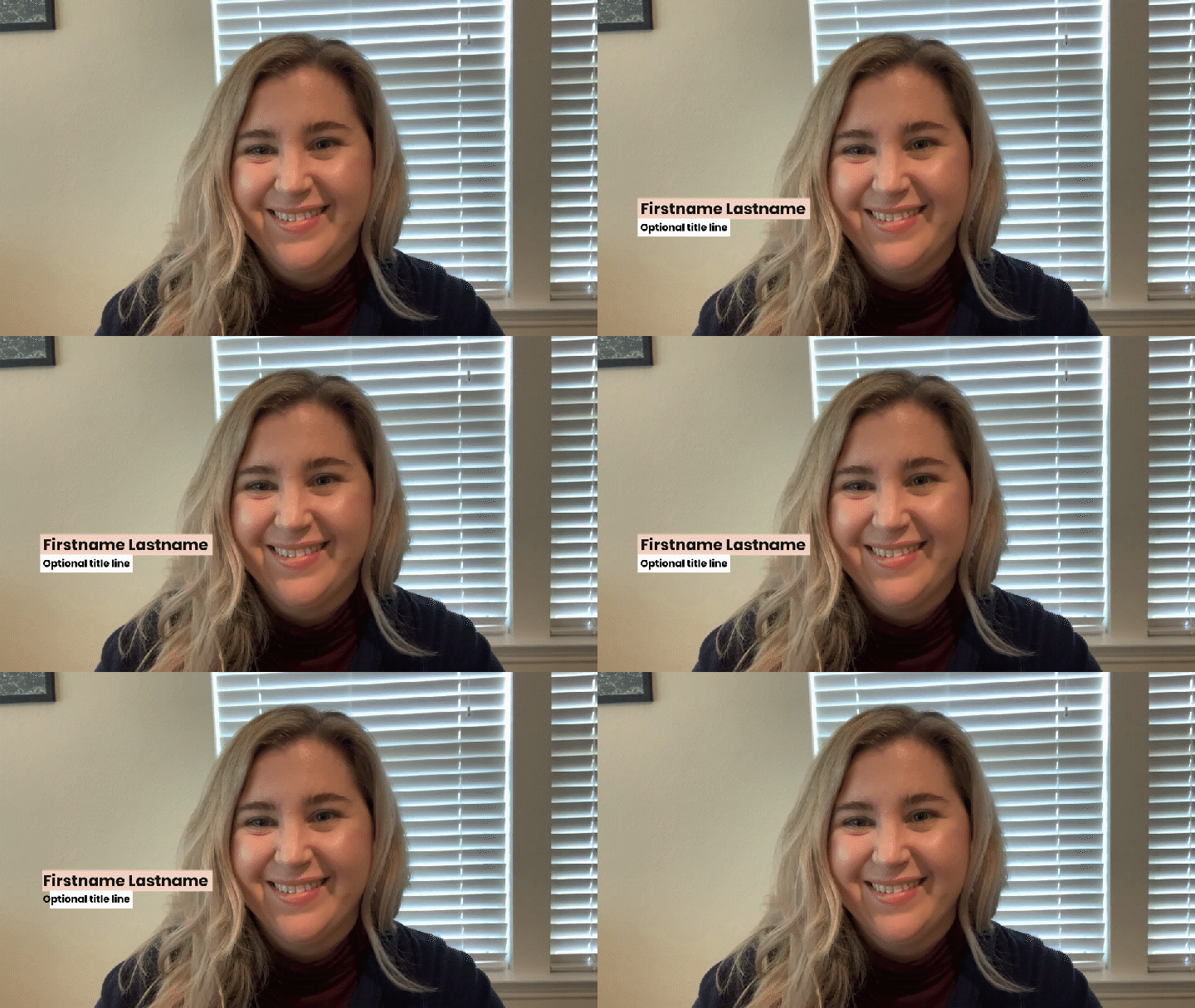
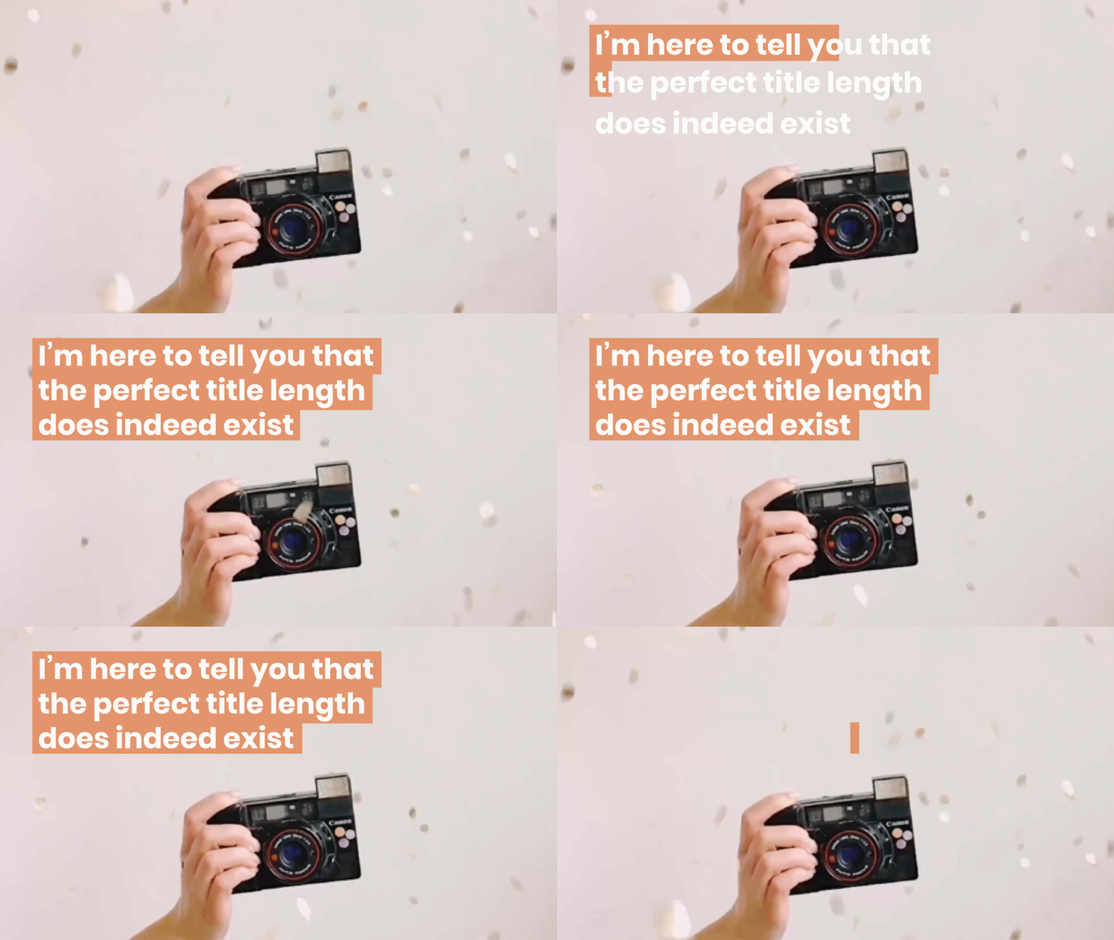
Moving type down from behind a mask is another way we can animate type on-screen. Primary uses are for more text heavy frames, lower thirds, and highlighted text.
This should feel fast, fluid, and come to a slow stop.
mask transitions
Masking can move in vertical directions, forwards or reverse, but avoid horizontal glides. Exit motion should continue in the same direction as the into motion.
text heavy frames
lower thirds
highlighted text
Footage transitions
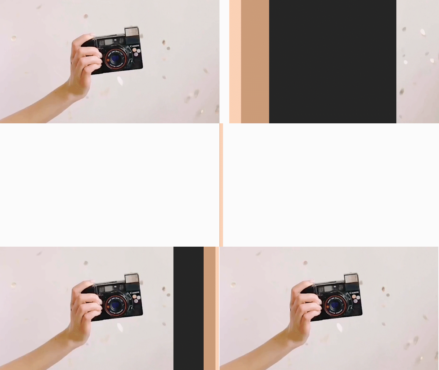
Moving between video sections without a title-card can use a wipe + trail effect in front or behind footage layers, or a circle zoom in/out. This should be quick and efficient, with peak movement in the beginning and easing the end to a slow stop.
wipe + trail
circle + zoom
Supers
All of the text should be highlighted, and the compound animation wipe + mask should be used sequentially line by line. Use the rectangle blocks in contrasting colors to call out important information.
hand graphics
Incorporating the sway hands in the title cards can be an added visual element that brings the human element into our videos
Title cards
There are a few different ways we can bring type on-screen, but sticking to some basic movements will help to simplify and unify videos to a common brand feel. Type should be sentence case and use punctuation.
The text should be concise and impactful, right aligned and exit over the next scene.
text only
text & image
End cards
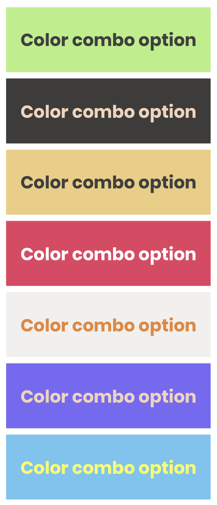
Two end cards can be used depending on the amount of time that is left. Each one ends witht he Softway logo and can be color coordinated to align with the primary color palette options for logo use.


