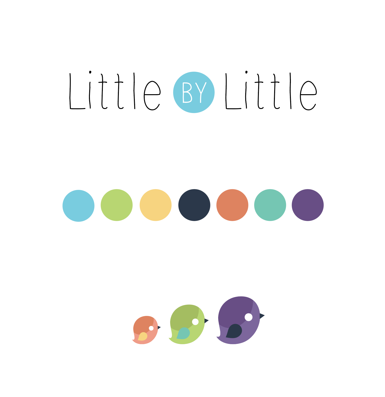
Foundational logo design and branding for a child-led pre-school
Situation
A new childcare center, was looking for a logo and foundational color palette before the launch of their company. They wanted their brand to reflect a playfulness and a focus on growth, as well as be a professional mark to establish them in their industry.
Task
They came to me asking if I could help give them an identity, provide them with a color palette and a scalable visual style that they could expand on as their company grew.
Action
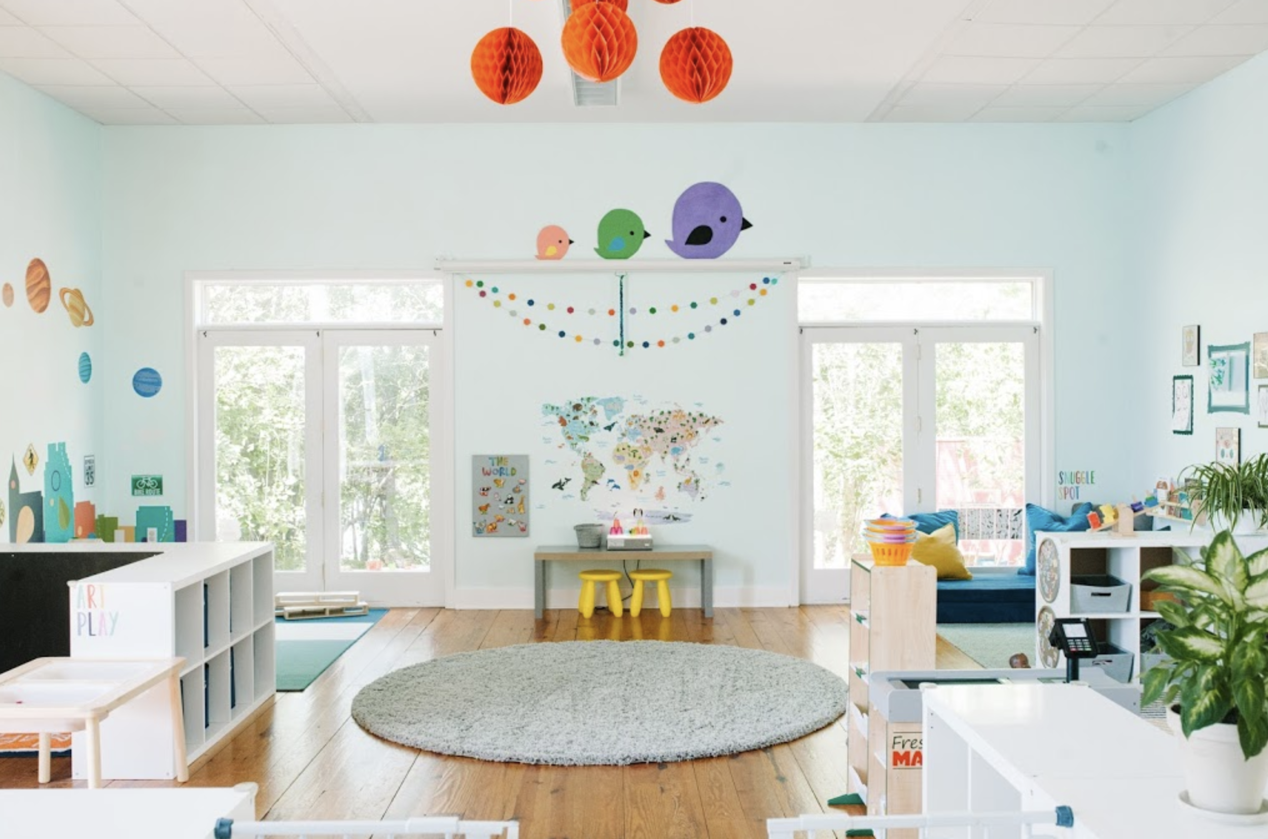
I researched the trends in the childcare industry and explored the relationship between the company name “Little by Little” and visual elements that represented that experience. We came up with the concept of growing birds to symbolize both the incremental childhood development, and the soaring creativity of youthful play. The color we chose were bright and fun, with a softness that expressed a warm and loving environment.
Result
Little by Little in Raleigh, NC is a thriving development center, now celebrating their new location with a growing enrollment list. The foundational brand is strong and lent itself to be built upon by the in-house design team, leading to a variety consistant and cohesive visual styling currently being used for their business.